Note: this post is a follow-up of a previous post of mine entitled, Workload.
If you didn’t bother, or did not read my previous post, I’ll just give you a recap of what had happened. In brief, I was the Head of Graphics of the school magazine, Semekar. Things happened and I did not get any chance to work on any of the graphics in the magazine. As a result, all the graphical work was done by our Mr. James with his excellent taste in which everyone in the magazine committee agreed. Struggling to keep Mr. James from tarnishing my name as the Head of Graphics and partly fuelled by my care for the school’s image, I offered to redo the cover designs for his own designs were hideous.

So, as I stated in the previous post, he agreed to consider a few more proposals and so I happily headed home and tried cook up something. This is what I have been looking forward for quite some time, being involved in designing a cover of a magazine and in this case, my school’s annual magazine. What I am often looking for is that feeling of looking at your own published work knowing that everyone else would be looking at it too, if not admiring it.
In the same way where I was involved in designing a poster for a guitar workshop organized by my uncle’s guitar company. A lot of hard work was put into it until it finally went to the printers. I would never forget that day when I walked up to my uncle’s guitar shop in KL and saw that very poster I was working on all month, pasted up majestically on the glass door in view for the public. The posters were distributed city wide to schools and institutions in KL. Imagine the amount of people who saw it and that, means a lot to me.
No, it’s not the credit, it’s not the fame. For I didn’t slap on my name on the poster and sat on my plush leather seat in my office waiting for potential customers the next day. It’s about self-satisfaction. In the case of my school magazine though, another factor came into play — that is, to improve my school’s image. To cater to those who judge a book by it’s cover, in the literal sense of that expression. I mean, we need to have an attractive cover for a magazine that shouts out to potential readers to pick it up and flip through it’s pages, right? And for such an underdog school like SMK JA, the more we need to stand out.
Alright, I’m not saying that my work would surely appeal to all readers. I’m only saying all this because I’ve seen and heard comments, good ones, about my work.
So, I headed home and started on it. It wasn’t easy. I spent three nights, working till 1am in the morning, glued to the computer, fuelled by cookies and iced chocolate drinks. And I must say, they turned out pretty good. Confident and all, I presented my proposals first, to my peers. I wanted feedback from the students themselves, for they are the majority of the readers. Fortunately, the feedback was positive, extremely positive, I say. Wuahaha!

Then, it was time to present my proposals to the big boss, Mr. James. And guess what, it was a-huge-failure. He plugged in my handy drive into his buggy computer while I remembered wondering how many viruses could have been transferred into it that very moment.
Casually, he clicked through all my proposals without a word and reached the end of the stack in less than 2 minutes before he proceeded to unplug the handy drive. Blurting out, ‘Hm, okay. Try to make some more designs. I’ll make some too, then we’ll see who’s better’. Frowning, I told him that I wouldn’t have any more time to do more — you know, exams. I guess what I said would have been a relief to him when he replied ‘Oh, nevermind then.’ and that was it, three nights of hard work down the sewer, rejected flat-out.
Bummer. It was since that very moment I swore to give up every attachment to the school magazine and decided to curse for it’s failure so that Mr. James would go down hard. But seriously, I didn’t lay any finger on it at all after that episode and until now I don’t know the status of the magazine. SPM’s over and it’s still nowhere in sight. My only guess is that they didn’t make it to printing before the term ended. Not suprising though, ‘cos everything was in a huge mess when I left the committee.
But oh well, it’s their problem now, isn’t it? If you think you can do everything by yourself without an open mind, by all means, you’re on your own. We’ll see how far can you go with that!
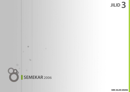
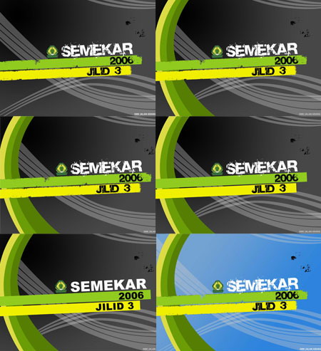
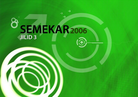
Gee, I really didn’t meant for this post to be this long. I really just wanted to show what our school magazine would have looked like. Well then, I’ll just get to the point. Since these proposals wont appear in any magazine anytime soon, I thought I could just share them here for the masses. So without further ado, the proposals with it’s variations in six versions, proudly produced in Adobe Photoshop:
V1: Simplicity
This one was based on my simplicity set of wallpapers I did some time ago. Minimalistic.

V2: Grungy
Inspired by the colours of the Brazillian flag. FIFA World Cup, anyone? Did anyone realise though, that our school logo bears that exact same colour scheme? Go figure. The two stripes in the middle sort of creates the effect of being painted on by a roller. And it has a grungy (dirty) effect so those black spots and stuff are entirely intended.

V3: Photo
Nothing much, just a photo I took of our school block with a couple of bars and lines and uh, the title of course.

V4: Fantasy
Girls would like this. Just for fun though.

V5: Notepad
A drawing pad design with photos.


V6: Grids
Tech-styled goodness. Themed green to match the school’s logo. Proved itself as a promising design among the rest.

Don’t keep up your hopes everyone, people whom I had shown my proposals to had pressed me to submit them. But unfortunately, these designs won’t make it. Mr James and Pn Polin were pretty determined in keeping Mr. James’ own design. So look out for it, if this year’s Semekar even comes out.
Sheng Han, you have a gift for designing!
I’m sooou gonna kill James Eddie (virtually speaking) for not accepting your proposals.
OUR MAGAZINE’S REPUTATION IS AT STAKE!