So we have this Research Skills and Report Writing subject this semester which require us to conduct surveys and pen a 2,000-word-minimum report.
Its kinda like your SPM’s BM paper two where they ask you to write a summary based on some table or chart of statistics. Only this time, you gather the statistics, painstakingly tabulate them, draw tons and tons of graphs, pie charts, tables and whatnot, and write a summary on every-freakin-graph. Then you’d have to discuss the data, draw obvious conclusions and cook up a few lame recommendations.
Worst of all, it’s due next week. Bummer.
I teamed up with Ah Wu and worked on student’s laptop ownership and use, a rather spur-of-the moment choice of a topic, you see.

Despite the stressful and brainjuice-draining efforts to think of a thousand and one different ways to interpret a graph, the findings are somewhat interesting to look at. Through the graph above, for example, you’ll see that 63% of Swinburne students actually own a laptop.
Rich bastards.
Well nevermind that, that percentage could be way higher in your campus but take a look at this:

We got our hands on stunning results on how Swinburnites use their laptops. Online research and completing assignments are actually the highest in frequency (notice how dishonest hardworking we males are!). But what caught me head-scratching was how ‘Gaming’, ‘Chatting’ and ‘Watching movies’ sank to the very depths of the scales.
If it were my graph of percentage of time against that list of activities, it’ll be an exact copy of that graph above — only rotated a hundred and eighty degrees.
I’m different.
Be afraid. Very, afraid.
——-
Thing is, I’ve been working on graphs everyday for the past week, I see graphs in everything.
I call it, the Graphoholic syndrome.
During last night’s tutorial, our Engineering Math test papers were returned. I looked at it, and a pie-chart materialised above my head.
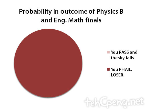
OMG.
lol. nevermind, work harder, and harder and harder until the pie turns pink next time. =)
Noooo! That would cause the sky to fall and spell the end for all mankind. Its ME on a mission to avoid pink pie-charts at all costs!
Seriously though, I need a miracle. =(
u missed out blogging in ur survey 😉
Oh my. I cant believe I actually missed that out. =(
lol its been a while since u updated. hmm.. i wonder how i came across ur blog last time. and u missed out porns in the survey. But i don watch porns though.
*winks*
LOL sheng han. The probability in outcome of Phys B, hilarious. haha
@jacky, yeah been really busy. =( LOL. Actually a ‘Porn’ category exists! See where the graph is cut off abruptly after ‘Watching movies’? Hehehe.
Seriously though, I would be chopped into pieces by my lecturer before I could include anything even remotely resembling porn. =P
@Harry, not so hilarious when the results agree with the pie chart. =P
hehehehe.. I always answer surveys dishonestly because I just dislike reading those long long questions..kekkekeke
Lol. You know, I was just wondering if i actually did a survey on how people answer questionnaires. That would be interesting! =P
LOLz
=(
Haha…fun to view your block!
Hi,I am newbies ^0^
Why thanks! Glad to have you here! =D